#215 Architecture
-
Gordon Armstrong
- Chair

- Posts: 241
- Joined: Mon Oct 20, 2014 9:02 pm
- Spam Protection: No
#215 Architecture
Let's ignore the judges who downgrade images of buildings as "record shots".
We will have some images of architecture and the built environment. I would anticipate some fine houses in all their glory, faded or otherwise' or maybe some detail and pattern in modern buildings.
Two weeks takes us to midnight 2nd February (I will be away so don't expect a prompt judging!!!)/
Enjoy
Gordon
"People say that nothing is impossible, but some times I can do nothing all day"
Gordon
Gordon
- Janice Freeman
- Iconic Photographer

- Posts: 607
- Joined: Fri Sep 09, 2011 1:43 am
- Spam Protection: No
- Location: Astley
- Contact:
Re: #215 Architecture
Liverpool - Old and New
"A good snapshot stops a moment from running away" Eudora Welty
Re: #215 Architecture
Light is everything and lighting certainly can transform this building at Astley Green into something special. I shoot a lot of images here, with all sorts of lenses, but this one excited me because of that low, rich sunlight. Corrections for verticals were made in Photoshop. Camera: Sony A7 Mk III. Lens: Sony FE 24mm f/1.4 GM.
Best regards
John
John
Re: #215 Architecture
Fleetwood lighthouse.
Joanne
"Anybody can be a great photographer if they zoom in enough on what they love." - David Bailey
"Anybody can be a great photographer if they zoom in enough on what they love." - David Bailey
- melbarnes
- Vice Chair

- Posts: 596
- Joined: Fri Jan 25, 2013 10:40 pm
- Spam Protection: No
- Location: Leigh
- Contact:
Re: #215 Architecture
Grand old house in Corfu. This is in an abandoned village called Old Perithia. When tourism started in the 1960's, the younger workers in the village left to live and work on the coast where the money was. The houses fell into disrepair, but the village has now become a tourist attraction, and some of the decayed houses are being converted into tavernas.
"Aim for the moon - if you miss you'll land amongst the stars."
- Paul Jones
- Iconic Photographer

- Posts: 2378
- Joined: Sun Sep 02, 2007 5:35 pm
- Spam Protection: No
- Contact:
Re: #215 Architecture
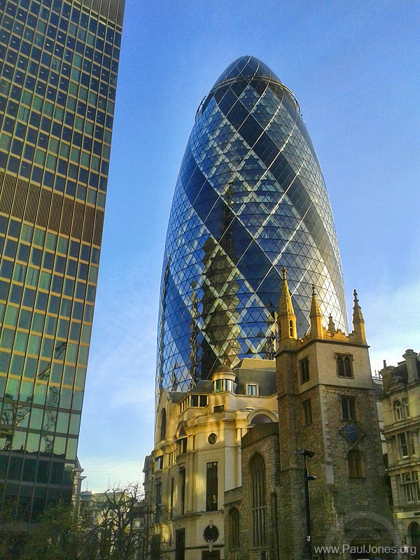
London - old and new architecture
Captured on mobile phone on the way to the office.

Captured on mobile phone on the way to the office.

Paul
================
http://www.PaulJones.org
"As usual Paul is absolutely correct."
"In short, Paul is an absolutely brilliant mentor."
================
http://www.PaulJones.org
"As usual Paul is absolutely correct."
"In short, Paul is an absolutely brilliant mentor."
Re: #215 Architecture
Apologies for using an older image, but this is the most unusual and fascinating architecture I've ever seen.
-
mikeaspinall
- Master Photographer

- Posts: 492
- Joined: Wed Jul 07, 2010 10:18 am
- Spam Protection: Maybe
-
Gordon Armstrong
- Chair

- Posts: 241
- Joined: Mon Oct 20, 2014 9:02 pm
- Spam Protection: No
Re: #215 Architecture
Thank you for your entries and your patience waiting for me to judge.
I like all of these images.
Janice: The Liverpool waterfront is a great place and I like the crowding and flattening of a long lens. The mix of architecture is interesting and the detail through the image is excellent. It has a processed look which makes it a little flat and it is slightly desaturated which I like. I do like the little spots of pink on the left.
John: Good photographer + good camera + good lens + great light = fabulously sharp detailed image. There is an optical illusion quality with the single row of windows, tiny steam engine, giant wheel and people mixing up the visual clues about size and perspective, and for me, I think the verticals are too straight
Joanne: Interesting building. I like the compass in the foreground and the low viewpoint.The detail starts to get a little fuzzy in the top tier and pinnacle. It might be worth cloning out the lamp post on the right.
Mel: An interesting building in harsh sunshine which works in context and the stone work texture is lovely. I like the interior detail visible through the windows. The accompanying story is important to an understanding of the image.
Neil: A nice example of typical scottish borders architecture This is fascinating building and makes a great imge. I love the colours and the detail. Very symmetrical but I wonder whether you could bring the sides in slightly to lose the part window and the two yellow patches sitting right on the edge of frame.
Joan: Wonderful solid Yorkshire architecture. Flat sky, but this is Yorkshire!!! I love the texture in the stone walls. Good viewpoint looking up the stairs but unfortunately you lose a bit of the ground floor as a result - perhaps you could sit on Neil's shoulders next time you visit .
.
Paul: My favourite of the modern London buildings dwarfing the older one's at the bottom. Lovely detail in the Gherkin and interesting light on the building behind the church but a bit more light on the church tower would have been great.
Sue: Faded glory indeed! This has obviously been a seriously grand house. It looks to be well preserved but without it's interior must feel rather sad. The bottom half of the picture is all stairs. The most interesting bit is the central area with the people for size and the hints of detail behind. As an architectural image the wings are important but I wonder whether you could crop out the gravel and bottom 4 steps to give a letter box presentation.
Lesley: I agree this is unusual and fascinating but I am not sure that I like it as a building. Your image is a great record with lovely colour tones and detail. It is slightly tight in the frame and I would like to see it slightly more in context but I think that is quite difficult because of it's position. I love the repeating windows in the straight half (Fred??) which all have slightly different tones or reflections.
Mike: Beautiful sense of light and space. I love the contrast between the darker tones to the left and the warm bright central area. Lot's of detail everywhere without crowding and the stained glass is fantastic. If I were a judge I might want to see the tops of the arches.
Many thanks to all. My comments are my own thoughts and I am trying to learn how to analyse pictures for my own benefit. If you don't agree then you are probably right!!!
At the end of the day, which picture do i like best:
2nd: everybody else
1st: Lesley.
Over to you.
I like all of these images.
Janice: The Liverpool waterfront is a great place and I like the crowding and flattening of a long lens. The mix of architecture is interesting and the detail through the image is excellent. It has a processed look which makes it a little flat and it is slightly desaturated which I like. I do like the little spots of pink on the left.
John: Good photographer + good camera + good lens + great light = fabulously sharp detailed image. There is an optical illusion quality with the single row of windows, tiny steam engine, giant wheel and people mixing up the visual clues about size and perspective, and for me, I think the verticals are too straight
Joanne: Interesting building. I like the compass in the foreground and the low viewpoint.The detail starts to get a little fuzzy in the top tier and pinnacle. It might be worth cloning out the lamp post on the right.
Mel: An interesting building in harsh sunshine which works in context and the stone work texture is lovely. I like the interior detail visible through the windows. The accompanying story is important to an understanding of the image.
Neil: A nice example of typical scottish borders architecture
Joan: Wonderful solid Yorkshire architecture. Flat sky, but this is Yorkshire!!! I love the texture in the stone walls. Good viewpoint looking up the stairs but unfortunately you lose a bit of the ground floor as a result - perhaps you could sit on Neil's shoulders next time you visit
Paul: My favourite of the modern London buildings dwarfing the older one's at the bottom. Lovely detail in the Gherkin and interesting light on the building behind the church but a bit more light on the church tower would have been great.
Sue: Faded glory indeed! This has obviously been a seriously grand house. It looks to be well preserved but without it's interior must feel rather sad. The bottom half of the picture is all stairs. The most interesting bit is the central area with the people for size and the hints of detail behind. As an architectural image the wings are important but I wonder whether you could crop out the gravel and bottom 4 steps to give a letter box presentation.
Lesley: I agree this is unusual and fascinating but I am not sure that I like it as a building. Your image is a great record with lovely colour tones and detail. It is slightly tight in the frame and I would like to see it slightly more in context but I think that is quite difficult because of it's position. I love the repeating windows in the straight half (Fred??) which all have slightly different tones or reflections.
Mike: Beautiful sense of light and space. I love the contrast between the darker tones to the left and the warm bright central area. Lot's of detail everywhere without crowding and the stained glass is fantastic. If I were a judge I might want to see the tops of the arches.
Many thanks to all. My comments are my own thoughts and I am trying to learn how to analyse pictures for my own benefit. If you don't agree then you are probably right!!!
At the end of the day, which picture do i like best:
2nd: everybody else
1st: Lesley.
Over to you.
"People say that nothing is impossible, but some times I can do nothing all day"
Gordon
Gordon
- Janice Freeman
- Iconic Photographer

- Posts: 607
- Joined: Fri Sep 09, 2011 1:43 am
- Spam Protection: No
- Location: Astley
- Contact:
Re: #215 Architecture
Some wonderful images here and a great choice. It’s a building of mixed emotions! Not sure if a like the building, but at the same time it is fascinating. That’s one of the great things about photography. Folk travel to places we never get to, see things that we don’t - but then we do, cos’ a great photo of it has been taken. 

"A good snapshot stops a moment from running away" Eudora Welty
Re: #215 Architecture
Wow, thanks Gordon - first time I've ever won a Forum Competition!
I'll put my thinking cap on and post a new competition topic later.
Lesley
I'll put my thinking cap on and post a new competition topic later.
Lesley


