Page 1 of 2
Rebecca 8th April 2011
Posted: Sat Apr 09, 2011 12:04 am
by John
From tonight's shoot with Rebecca:

Re: Rebecca 8th April 2011
Posted: Sat Apr 09, 2011 9:02 am
by Paul Jones
Hi John - do you want some feedback / comments?
Re: Rebecca 8th April 2011
Posted: Sat Apr 09, 2011 10:18 am
by John
If you want to make comments please do.

Re: Rebecca 8th April 2011
Posted: Sat Apr 09, 2011 3:40 pm
by Paul Jones
OK. I asked because I've seen a few times photos being posted and people maybe reluctant to post comments (good or bad). It's the reason I started my 'please comment' thread a few days ago.
I really like the way you've captured her personality here. You always seem to bring out the 'naturalness' of people, in a good way. But there's a few things that detract or distract, for me anyway.
- The piece of cotton hanging down off her shirt near her right elbow
- The dirty marks on the floor all around her
Five minutes with the clone tool or healing brush would tidy those up.
Lastly, if you could have got a touch more light on her face it could have brought her eyes out more
I know I'm telling you things you already know. I hope you don't mind.
Re: Rebecca 8th April 2011
Posted: Sat Apr 09, 2011 4:22 pm
by John
I don't mind at all and I agree it's rough and ready as shots go. There will be more considered ones later, but I did want to share that Becky was an attractive and skilled model. She did a great job!
Re: Rebecca 8th April 2011
Posted: Sat Apr 09, 2011 5:02 pm
by kevinlowe
I have to say how much I enjoyed last night, and how grateful I am for the help I received. It was a great first time, and I look forward to many more. Here's a shot I took, comments extremely welcome.
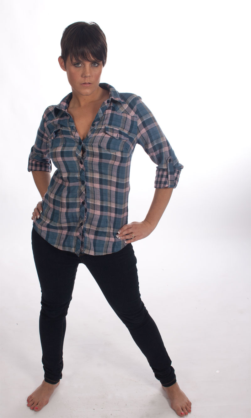
- rebecca.jpg (97.79 KiB) Viewed 8719 times
Re: Rebecca 8th April 2011
Posted: Sun Apr 10, 2011 12:18 am
by Paul Jones
Hi Kevin
I hope you don't mind, but I couldn't resist having a play with your photo. If you're offended just let me know and I'll remove it.
The photo started off fine with the facial expression and the pose, but then we got to the dirty floor and the feet, and I was wondering "why?" Why do we need the feet or the floor in the shot? Do they add anything, or do they distract the eye away from the girl?
I've attached a 'before and after' to show how different composition can change the emphasis of a photo. When you look through the viewfinder ask yourself if there is anything in the shot that you don't need.
I've also brightened it up a touch (Curves), desaturated the reds slightly and defogged it a little.
Let me know what you think.........

Re: Rebecca 8th April 2011
Posted: Sun Apr 10, 2011 9:30 am
by kevinlowe
Hi Paul,
no, i'm not offended at all. I want to learn, and it's great to see how good my photo could look.
I've never really used curves at all, I have kind of got my head around levels but that's about it for my adjustments knowledge in photoshop at the moment. What does 'defogged it' mean, and how would I do that?
I do appreciate what you are sayinbg about composition, I must admit on friday I was a bit preoccupied with trying to get my head round telling the model what to do and let composition fall by the wayside a bit. I know I can always crop it after, but I do want to try and get myself into the mindset of geting as much right in camera as I can.
Thanks for the comments, and the retouching. It all helps a great deal.
Re: Rebecca 8th April 2011
Posted: Sun Apr 10, 2011 10:50 am
by kevinlowe
I tried doing the things you did to one of my other shots (after a quick google search for defogging) and think it looks better. I think curves may take a bit of getting used to though.
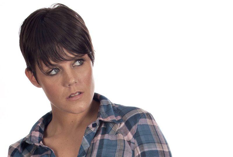
- rebecca head shot.jpg (94.33 KiB) Viewed 8684 times
Re: Rebecca 8th April 2011
Posted: Sun Apr 10, 2011 3:00 pm
by PhilipHowe
Kevin, I like that one a lot more than the first. I really like portraits diplayed in landscape and think that blank space emphasises and frames a phot better. After all, we all see in landscape, tvs are in landscape, almost all monitors are etc.
The angle of the head is good. I think the colours need a little punch, but if that is what you achieved from your first studio shoot, I'd be getting the second one booked now and get some momentum going. When you get an idea of scope between what you took and what you can achieve with it, you start to think of what you want to end up with and work backwards.
I agree with Paul by the way on cropping, but that's beacause I don't like feet in photos!
Re: Rebecca 8th April 2011
Posted: Mon Apr 11, 2011 8:45 am
by Theo Dibbits
Kevin
I know it is easy to pick at other peoples images and that is probably why most people stay away from it.
Look however at the skin tones in Paul's retouched image and the later portrait.
To get similar tones in the second image I dialed in 12 of saturation leaving the dropdown box set to master, pulled both sides in on levels but reduced the opacity to 70% and he presto.
I am not going to publish a revised image, just have a go and see.
If you are thinking of using it in a comp make sure you have some details in the hair on top of the head as that is a pet subject for many of the judges.
Theo
Re: Rebecca 8th April 2011
Posted: Mon Apr 11, 2011 12:03 pm
by Paul Jones
kevinlowe wrote:
Hi Paul, no, i'm not offended at all. I want to learn, and it's great to see how good my photo could look.
I do appreciate what you are sayinbg about composition, I must admit on friday I was a bit preoccupied with trying to get my head round telling the model what to do and let composition fall by the wayside a bit. I know I can always crop it after, but I do want to try and get myself into the mindset of geting as much right in camera as I can.
Thanks for the comments, and the retouching. It all helps a great deal.
Thanks Kevin
For a first shoot I think you did a good job.
I appreciate that there is so much to take in.
I well remember my first shoots and I still occasionally make mistakes after a hundred or so model shoots...
Theo Dibbits wrote:
If you are thinking of using it in a comp make sure you have some details in the hair on top of the head as that is a pet subject for many of the judges.
Good point.
You might notice in my retouched image that I cloned in her hair at the top of her head to cover the gap.
Re: Rebecca 8th April 2011
Posted: Mon Apr 11, 2011 7:25 pm
by GERRYG
THESE ARE TWO IMAGES SHOT IN HDR AS AN EXPERIMENT. THE CAMERA WAS HAND HELD, STUDIO LIGHTS BUT NO FLASH WAS USED.
Re: Rebecca 8th April 2011
Posted: Mon Apr 11, 2011 9:00 pm
by Tracey McGovern
Hi Gerry
You have got two very striking images here, looks like you have got the hang of HDR, you'll be giving Keithybabes a run for his money

I don't know how much time you have spent on these, but it looks like alot, they are very effective and make you want to look at them in close detail, I don't know how they would do in competitions, you know what some judges are like, they will either love them or hate them but for me, I like them, they are different.
Best Wishes
Tracey
Re: Rebecca 8th April 2011
Posted: Mon Apr 11, 2011 9:08 pm
by -KT
Loving Beckys skin on the first one Gerry, it' defo my fav out of the two!