Page 1 of 1
Trentham Gardens
Posted: Fri Nov 25, 2011 2:56 pm
by kevinlowe
I spent a really enjoyable day at Trentham Gardens yesterday, in Staffordshire. I can definitely recommend it for a day out with your camera (is there any other kind?)
Just before leaving I took this shot. I can't decide if I like the drama of the sky, or if the highlights are too distracting and take over. I keep changing my mind. Anybody got an opinion? Not just on the sky, but on the picture as a whole.
Oh, and I know, don't start a shot on water. But the only thing in front of the water was a wall, and I was leaning on that

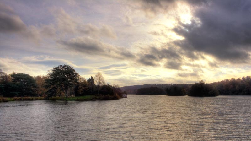
- Trentham-Lake-web.jpg (51.24 KiB) Viewed 5582 times
Re: Trentham Gardens
Posted: Fri Nov 25, 2011 3:19 pm
by John
The composition is good and the sky is pleasing. But I wouldn't go so far as dramatic, it looks a little weak really. If you had some sun on the distant trees it would have helped enormously to give the image more "pazazz" or "bite" - not an easy one with the lighting that you had.
However, I do feel that as a letterbox format the picture can be enhanced. This removes much of the bland water and tightens up the composition. Then perhaps a lift in Photoshop....
If this does look more dramatic on your screen, then maybe check that you are not posting an AdobeRGB image. Images for the forum need to be sRGB to get accurate colours and contrast.
Re: Trentham Gardens
Posted: Fri Nov 25, 2011 4:27 pm
by Paul Jones
kevinlowe wrote:
I can't decide if I like the drama of the sky, or if the highlights are too distracting and take over.
The highlights aren't too distracting for me, but if you shot in RAW you could try processing the same file twice to eliminate them, ie:
- open the RAW file slighly underexposed so the highlights aren't noticeable
- then open the same RAW file this time with correct exposure
- paste one on top of the other and use a layer mask to show/hide the parts you like
Re: Trentham Gardens
Posted: Fri Nov 25, 2011 7:04 pm
by kevinlowe
Thanks for the comments and advice. Here's the pic in a letterbox format, I think you're right that it makes a more pleasing image. I've decided I do like the highlights, especially in this format.
I'll go away and try working on them though, just to see what what I can get from it.
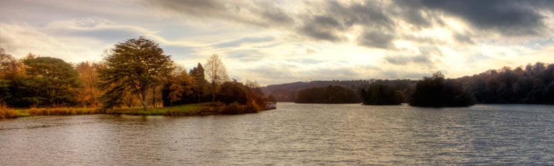
- Trentham-Lake-web-lbox.jpg (35.68 KiB) Viewed 5560 times
Re: Trentham Gardens
Posted: Fri Nov 25, 2011 10:37 pm
by John
I think that's much better.
Re: Trentham Gardens
Posted: Sat Nov 26, 2011 7:51 am
by pammie
I am not bothered if the image "starts on water", but what I do think looks odd (which you hadn't done anyway) was to have some boulders for example and half chop them off at the bottom. Either have them in or not.
I do think the letterbox format suits better.
cheers
Re: Trentham Gardens
Posted: Sat Nov 26, 2011 6:10 pm
by Tracey McGovern
Hi Kevin
Yes - much much better and you have brought out some lovely colours and detail in the trees on the left.
Tracey