Page 1 of 1
A little bit fruity
Posted: Sun Mar 11, 2012 4:37 pm
by paulinefisher
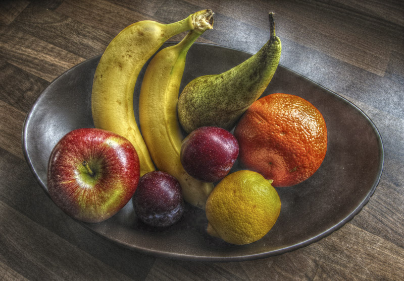
Playing around with HDR

- Fruit Bowl 4.jpg (170.39 KiB) Viewed 5733 times
Please vote and/or comment.
Thanks for looking
Pauline
Re: A little bit fruity
Posted: Sun Mar 11, 2012 7:41 pm
by Paul Jones
I'd say that it almost works.
I like the wooden table and the metal dish.
The lighting overall is sympathetic to the shot.
I think you could have found more attractive pieces of fruit, for example better bananas and a more tempting lemon.
The orange looks like it's been copied and pasted into the picture (has it?) There's little shadow and depth to it.
Good try.
Thanks for posting.
Re: A little bit fruity
Posted: Sun Mar 11, 2012 8:54 pm
by paulinefisher
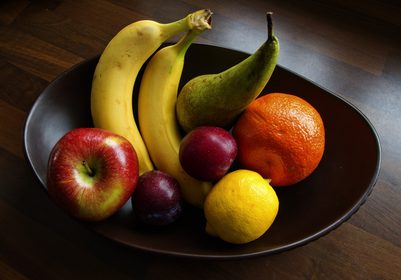
Thank you Paul, the fruit wasn't as bad as it looks and the orange was in there, here is the original for comparison. Taken on my kitchen worktop. Window light.

- Fruit Bowl adaps.jpg (159.47 KiB) Viewed 5723 times
Re: A little bit fruity
Posted: Sun Mar 11, 2012 9:56 pm
by John
It's almost there, but needs some attention to the lighting. There is a large area of reflection on the worktop and this competes with the subject, so the lighting needs to be carefully arranged to avoid the reflection. Maybe a polariser would also help.
The arrangement of the fruit is an important part of the still-life and playing with various postionings would also be worthwhile.
Hope that helps!
Re: A little bit fruity
Posted: Mon Mar 12, 2012 10:47 am
by Paul Jones
paulinefisher wrote:
... here is the original for comparison.
Thanks Pauline.
I can see what you're trying to achieve with the HDR treatment. I think the fruit looks more inviting in the original image though, particularly the lemon.
It's good to try these things.

Re: A little bit fruity
Posted: Mon Mar 12, 2012 2:53 pm
by Janice Freeman
Hi Pauline, I like the 'gritty effect' of the fruit in the first image, however, I think perhaps I would have angled my bananas slightly differently - bit too upright! (No innuendos intended!!!)
Re: A little bit fruity
Posted: Wed Mar 14, 2012 2:35 pm
by mike-e
Hi Pauline,
I like the tones and colours in the original, and sometimes smooth tones become far too exagerated in the HDR version.
But, the ruggedness of the wooden table, and the grittiness of the bowl removes the highlights John refers to.
The trick is to combine the two ( does that make it a smoothie?) This way you have all the texture you like and where you like it.
Use the HDR layer as the base layer, and original ontop and erase away to reveal the wood and metal. a soft brush 65 pixels, no hardness, and maybe 40-60% opacity on the brush will allow you to build up depth.
You could add a muliply layer on top of the hdr one to make it more in keeping to the original tones, and adjust the opacity on that too.
All in all it has a paintely feel which I like.

Mike-e