Page 1 of 1
Comp #89 GEOMETRY
Posted: Wed May 30, 2012 9:19 pm
by pammie
Hi all,
for the next comp I have chosen the subject "Geometry". This can be interpreted in any way, i.e. table top, architecture, landscape, etc.
I will be looking for strong lines and blocks/shapes, and how well the subject chosen fits the brief.
As there is a holiday coming up, I will extend the time to 3 weeks, and the closing date will be midnight on Weds 20th June.
Happy shooting!!
P
Re: Comp #89 GEOMETRY
Posted: Wed May 30, 2012 11:33 pm
by yachtsman1
My entry this month was taken earlier this month during a 3 day trip to Salford quays, taken on the only day the sun shone.
Eric.
Re: Comp #89 GEOMETRY
Posted: Thu May 31, 2012 12:29 am
by John
"Multi-Faceted" shot at the Art Gallery in Manchester:

Re: Comp #89 GEOMETRY
Posted: Fri Jun 01, 2012 7:15 pm
by Matthew
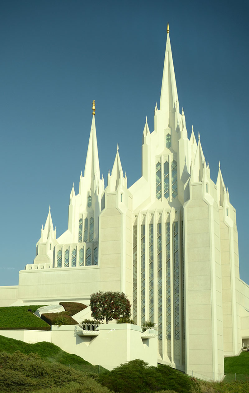
My entry was taken a few weeks ago . A Mormon church near San Diego
Matthew
- geometry.jpg (158.72 KiB) Viewed 10832 times
Re: Comp #89 GEOMETRY
Posted: Sat Jun 02, 2012 10:35 pm
by Stu B
Geometry (Greek γεωμετρία; geo = earth, metria = measure) is a part of mathematics concerned with questions of size, shape, and relative position of figures
Re: Comp #89 GEOMETRY
Posted: Tue Jun 05, 2012 12:47 am
by bazzasmeg
- Knaresborough Station.jpg (224.72 KiB) Viewed 10775 times
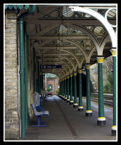
Knaresborough Station support stanchions
Re: Comp #89 GEOMETRY
Posted: Tue Jun 05, 2012 10:10 am
by mancunian61
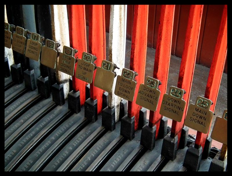
Mixed signals!
- DSCF5684 Ipiccy.jpg (102.72 KiB) Viewed 10763 times
Re: Comp #89 GEOMETRY
Posted: Thu Jun 07, 2012 2:12 pm
by Janice Freeman
Under My Umbrella
Re: Comp #89 GEOMETRY
Posted: Fri Jun 08, 2012 6:33 pm
by KEASLA
Re: Comp #89 GEOMETRY
Posted: Fri Jun 08, 2012 9:47 pm
by Tracey McGovern
Mill Colonnade, Karlovy Vary, Prague
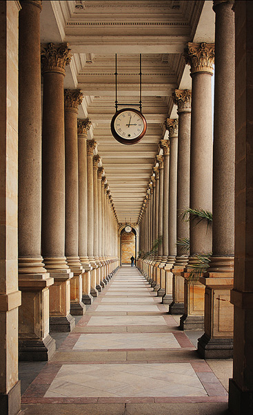
- Mill-Colonnade-Karlovy-Vary.jpg (121.18 KiB) Viewed 10704 times
Tracey
Re: Comp #89 GEOMETRY
Posted: Thu Jun 21, 2012 8:45 pm
by pammie
Thanks to all that entered. I wonder how many of you are going out and about with your cameras with this awful weather we are getting. Longest day today too, and we haven't had a summer yet!
Eric - I like the blocky pattern of the tower blocks (albeit posh tower blocks!) and the repetition of 3. The sky is reasonable, but I feel a little more could have been acheived by choosing a different viewpoint, to get some different perspective. I think perhaps more directional light in the early morning or evening could have enhanced the image. All in all a good effort and a good subject.
John - multi faceted indeed! I like the restricted colour palette in this one, and find it interesting that the floor and seating are at the top of the image, not the bottom where you would expect them to be. A very good geometric example and well seen and taken.
Matthew - I love the spires and angular shapes to this church, innovative architecture. The crisp white stands our well from the blue sky, it almost looks like a card cutout somehow. The lighting is quite strong, so some loss of detail on the stonework, but nonetheless an excellent example of geometric shapes.
Stu - I do like the strong bold lines and shapes in this image. The viewpoint gives the building strength and a good base for the tapering tower, good use of perspective. Restricted colours suit this subject, concentrating the eye on the shapes.
bazzasmeg - Good perspective on this one, and a repeating pattern draws the eye down the whole image. I like the mixture of linear pillars with the curves of ironwork, mirrored by the curve of the tunnel beyond. Well seen and taken!
mancunian 61 - now we have lines, curves and squares! Red is such a dominant colour, but has been used here to act as a backdrop to the brass plates, which stand out well. The diagonal line of where the levers meet the grey curved bits is well placed and a strong component of the image.
Janice - Good strong linear pattern from the central portion of the umbrella, which I like with the spiral (spring) on. Again, limited colours really focus your eye on the composition of the image. I feel it was a good choice not to place the centre of the umbrella in the centre of the image, it has more strenght compositionally as you have presented it.
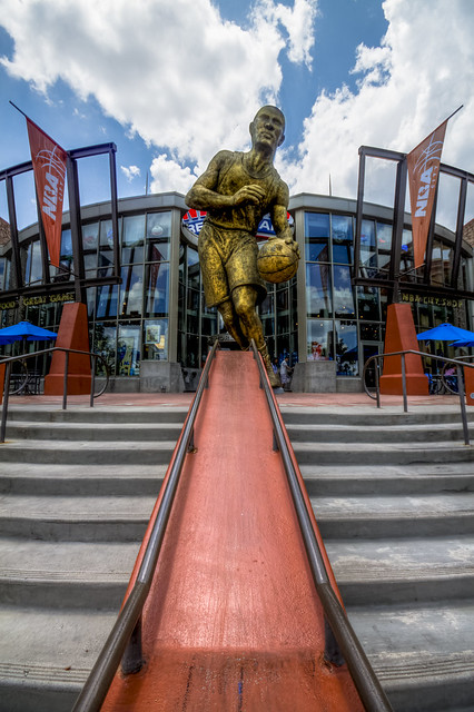
keasla - I love the compostion of this one, the symmetry is great. There would also have been some great reflection images in those glazed panels. The symmetry is broken by the statue, which has a great lead in with the reddish coloured ramp in front of it. The blues and orangey-reds contrast very well too.
Tracey - As bazzasmeg's image - great perspective and those columns really draw your eye down to the back of the image. That figure is so important, it adss scale, and I like the circular clocks as a contrast to all the linear structures. I also think the plants creeping in help soften the image a little. Beautiful colour range.
So, I have to pick a winner from these images, and there were a lot of good strong images here. In reverse order we have
3rd - Stu
2nd - John
1st - Tracey - Well done!
It's now up to Tracey to chose the next subject and judge the next comp. Once again, thanks to all who entered and I hope you had fun with it
Cheers Pammie x
Re: Comp #89 GEOMETRY
Posted: Thu Jun 21, 2012 10:07 pm
by John
Many thanks for that Pammie and we'll all look forward to seeing what Tracey has in store for us next!
Re: Comp #89 GEOMETRY
Posted: Sun Jun 24, 2012 7:13 pm
by Tracey McGovern
Thanks Pammie for making me the winner, totally unexpected, there were some really good images to choose from. Sorry for the delayed response, I've only just got back from being away for a couple of days. I'll have a think about the next competition subject and will post asap.
Tracey