Page 1 of 1
Which Image?
Posted: Wed Mar 19, 2014 11:43 pm
by John
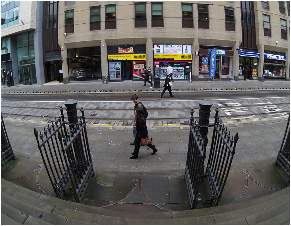
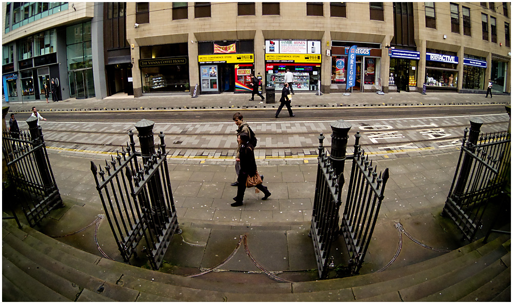
Here's two images, with three questions: Do you like them, which one do you prefer and why that preference? Thanks for any replies!

- 087 Passing By.jpg (361.57 KiB) Viewed 4880 times

- 088 Passing By 2.jpg (359.64 KiB) Viewed 4880 times
Re: Which Image?
Posted: Thu Mar 20, 2014 12:11 am
by Janice Freeman
I do like the images and my preference is for the second. Firstly I like the use of the fisheye which gives a gentle curve to the scene. The second shot has warmer tones and slightly more contrast and it just gives the image a better feel. It also has a slightly wider view, opening out a bit more of the scene and giving a better balance and symmetry.
Janice.
Re: Which Image?
Posted: Thu Mar 20, 2014 9:07 am
by PhilipHowe
John, I haven't commented on anything for ages, so I'll have a go...
I like fish eye photos, however, for me, they have to be way over the top, as I'm trying not to say 'I wonder what the photo would look like straightened'.
Being from the North East, and a bit of a pasty nasher, I'm feeling quite distracted by the blue sign just to centre right.......
Out of the two, I'd prefer the bottom one, as per Janice, due to the contarast, however, I think it needs a bit more interest (other than Greggs).
Re: Which Image?
Posted: Thu Mar 20, 2014 9:38 am
by John
Thank you both, anyone else have any thoughts?
Re: Which Image?
Posted: Thu Mar 20, 2014 5:41 pm
by Paul Jones
John wrote:
Do you like them?
I don't dislike them.
John wrote:
which one do you prefer?
The second image.
John wrote:
and why that preference?
More saturation, warmer colours.
Re: Which Image?
Posted: Thu Mar 20, 2014 10:32 pm
by Tracey McGovern
Hi John
I prefer the second one because of the warmer tones, the wider view and the treatment. However, I have to agree with Phil's comments, I'm finding myself reading the signs and not looking at the rest of the image but I do like the fish eye effect and the gate runners at the bottom mirrors the curve of the image.
Tracey