First of all, thank you to everyone who entered the competition. I must admit that for the first few days it looked like no one had any interest in it. Then slowly, but surely your entries started to come in. Needless to say, I was relieved!

A good batch of images all-in-all, but a few did stand out though to be amongst the best three, which are they? All will be revealed at the end of this post.
Dandelion, by Gewn Barnes.
A good frame-filling close-up of the yellow flower with some nice detail. It’s obviously difficult/impossible to de-focus backgrounds with a camera phone, so there is unfortunately a lot of distracting background around the central flower. A tighter, square crop may have helped a somewhat.
Moreton Hall, by John Riley
A good record shot, lifted by the strong green and blue of the sky and grass. Only thing is the presence of too many people - yes my rules make it hard to clone them out I know, but ‘dems da rules’

Jess the Horse, by Donna.
Lovely animal Donna! A good mono image with a pleasing pose from your steed - nicely framed by the stable door - just not quite as strong as the top three though.
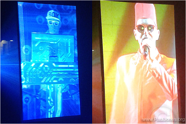
Chris Lowe and Neil Tennant, by Paul Jones.
A very different type of portrait, very colourful and original. A good idea using the video screens (if not cheating a little maybe

). That aside I liked it! The main reason that this didn’t do as well as some of the others is because it is effectively two images stuck together really.
Bluebells at Brockholes, by Mel Barnes
I like the diagonal composition in this image Mel, good work! Perhaps a bit more contrast would have helped to make the blues of the Bluebells ‘pop’ a little more though. I also think perhaps you could crop off the left hand side of the image, as the area to the right where all the flowers are is the main focal point.
Manchester Eye, by ark Dyson - THIRD PLACE
Very moody this one, I like the clouds behind the wheel which creates a strong silhouette - the B&W conversion is very good too! The only niggle I have (which kept it from the top spot) is with the composition. I would have liked to see more of the wheel. All said and done though, an excellent shot Mark!
Untitled (waterfall), by Walter Brooks - SECOND PLACE
Just when I thought all entries were done with - this image popped-in from Walter. And what a cracker it is! The toning on this iPhone image is superb, it’s very rich. I would be happy to put this in an open competition if I was walter. A well deserved second place. I did nearly make this the winner, but I’m again, not 100% happy with the composition - good as it is overall though.
So the winner has to be....
Untitled (wire-wool) by Michael Collier - FIRST PLACE
Loved it as soon as I saw it. This image has impact as well as strong symmetrical composition. It shows off what can be done with a camera phone, even though this image has no real tonal range, I still like it. I think Michael has done really well capturing this scene hand-held - it's a worthy winner!
Good work by all entrants and thanks again to all those who took part in this competition, hopefully ADAPS may one day have a special club competition for mobile photography.
Andy Butler


