Page 1 of 2
Competition #12 - Red
Posted: Thu Mar 27, 2008 9:53 pm
by pammie
Hello All....
The theme for the next on line competition is RED. It is very open to interpretation, a colour image, or a monochrome with selective toning, anything in between. The subject could be a flower.....or a doorway.....pillar box.....person with a red umbrella or coat......part of a car or motorbike........phone box in a landscape.......anything else you can think about.........anything as long as the main subject is red. Hopefully the range of interpretation is wide enough for everyone to have a go.
Because the server is going to be down for a couple of days, the closing date will be midnight on Saturday 11th April.
Hope you enjoy it......Pammie
Re: Competition #12 - Red
Posted: Sun Mar 30, 2008 9:03 pm
by John
Red Tractor, Red House. Shot at Crich Tram Museum.

Re: Competition #12 - Red
Posted: Sun Mar 30, 2008 9:34 pm
by Myra
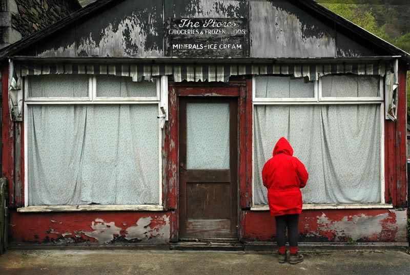
Taken at Glenridding.
Myra

Re: Competition #12 - Red
Posted: Tue Apr 01, 2008 8:44 pm
by Tracey McGovern
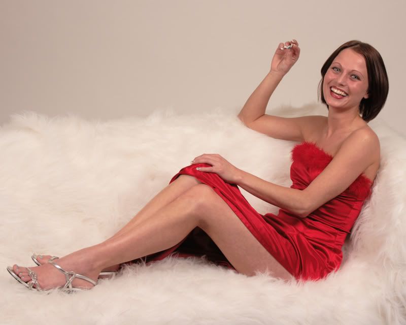
Kelly in Red Dress

Tracey
Re: Competition #12 - Red
Posted: Tue Apr 01, 2008 9:40 pm
by Sue
Red

Re: Competition #12 - Red
Posted: Tue Apr 01, 2008 10:11 pm
by Des

Des
Re: Competition #12 - Red
Posted: Wed Apr 02, 2008 4:06 pm
by Walter Brooks

Study in Scarlet
Re: Competition #12 - Red
Posted: Wed Apr 02, 2008 6:55 pm
by sunsworth

A snowy day in Paris, and someone had lost their brolly
Re: Competition #12 - Red
Posted: Mon Apr 07, 2008 7:25 pm
by lynne.6
Re: Competition #12 - Redhttp://i235.photobucket.com/albums/ee61
Posted: Mon Apr 07, 2008 9:32 pm
by lynne.6
Re: Competition #12 - Red
Posted: Tue Apr 08, 2008 9:22 am
by Paul Jones
Hi Lynne - I added the photo for you.
To add a photo you need to wrap the web address (url) of the photo within the 'Img' tab.
Re: Competition #12 - Red
Posted: Wed Apr 09, 2008 9:43 pm
by bazzasmeg

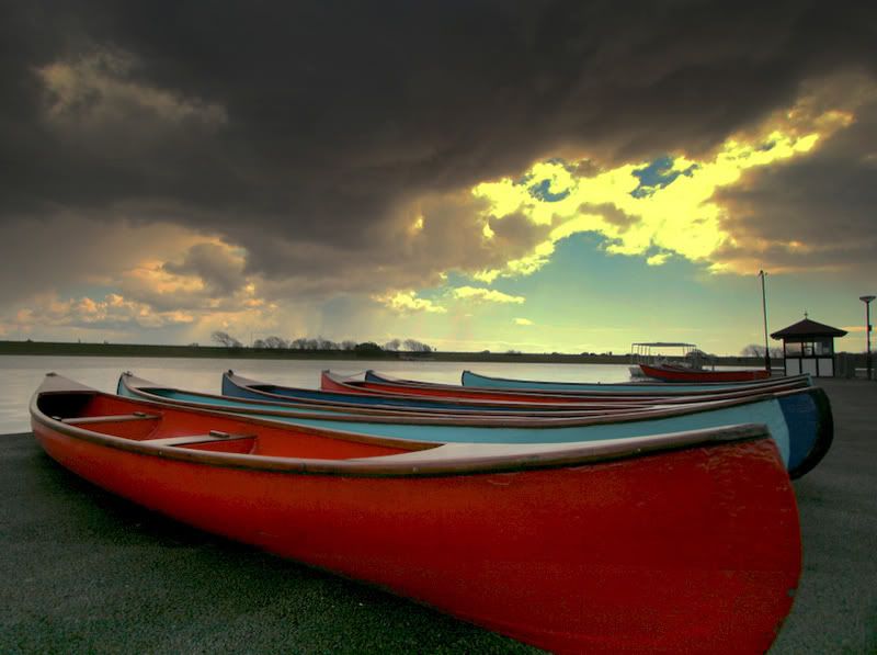
Boats Fairhaven Lake
Regards, Barry
Re: Competition #12 - Red
Posted: Sun Apr 13, 2008 6:38 pm
by TerryMooney
Inside a Poppy Head
 TerryMooney
Re: Competition #12 - Red
Posted: Sun Apr 13, 2008 9:53 pm
by pammie
Thanks to everyone for entering this competition, I will post the result on this site tomorrow evening, Monday 14th April.
Re: Competition #12 - Red
Posted: Mon Apr 14, 2008 7:07 pm
by pammie
Many thanks to all that entered, the entries covered a range of subjects, which was one of the aims in setting the title I did. I don't pretend to be an expert, but just to "judge" on what I feel makes a good overall image. Likewise, I might have done things differently myself, but you have to look at what is presented and not criticise an image just because it might not be exactly what you would have done.
Right, here we go....
Red tractor by John - I like this image, especially the way the red objects are spread through the picture from left to right; the tractor leads you the red window shutters then the door beyond that.
Myra - I don't know why but I found this image quite disturbing; it may be the decaying paint on the shop front, that was once a brighter red; or the figure in the bright jacket......perhaps it harks back to "Don't look now", a reasonably sinister film (in parts) from a Daphne duMaurier story.
Kelly by Tracey - The model has a nice smile, and I like the way the arms partly parallel each other, and the raised arm almost follows the lines of the legs. I think the red dress may have been shown off a little more by a dark background, but can't really hold that against it.
Red windmills by Sue - These quirky little winmills (or whatever they are!) make a good abstract pattern, and perhaps I might have cropped out the wall and plants to make even more of an abstract.
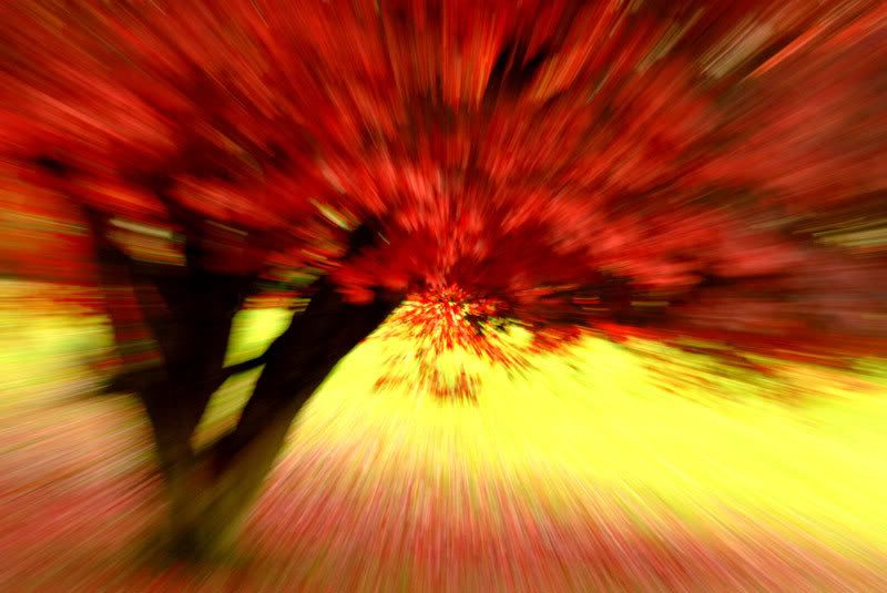
Zoom tree by Des - not sure why, but I quite like this. Not tried this method myself, but it makes quite a striking image.
Walter Brooks - well you cannot say this does not encapsulate the title of the competition! I like the way the pins and the unpicking hook point towards the button, and draw your eye to the bottom of the picture. All in all, a pleasing arrangement.
Sunsworth - I enjoyed the almost monochrome palette of this image, contrasted with the red umbrella. A lot!
Postbox by Paul - Nice study of a postbox; liked the textures and shapes in the stones of the wall, the natural colours contrasting with the bright red. Also, the post box has "breathing space" with the empty space before the milage markers. I could imagine there might be some criticism of this empty space, but I think it helps to balance the image.
Portrait by Lynne - here the red is set off by the dark background. The model looks a little caught off guard though to me, but I do like the expression in her eyes.
Bazzasmeg - nice shot of boats on the lakeside/foreshore. I like the recession in the image, and the red boats are repeated down the line, I think the blue breaks them up nicely. I feel that something is a bit odd about the very bright patch of sky, the colour looks a little strange, but as I wasn't there to see for myself I'll shut up!!
Poppy head Terry Mooney - I like the idea of this image, I feel the main focus is on the black centre of the flower, as this is quite intracate. The highlighted edges of the petals are perhaps a bit too distracting, but a nice idea.
Drum Roll please!!
3rd - Red Tractor by John. I liked the red flowing through the image.
2nd and 1st swapped a few times, but ......
2nd - goes to Myra, even though I found this a tad unsettling. But it made an impression on the me, the fact the impression is slightly negative (emotionally speaking) is neither here nor there.
1st - Sunsworth. I really liked this image, well done!!

