Page 1 of 1
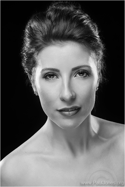
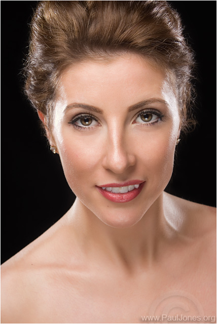
Philippa - Classic Beauty
Posted: Sat Sep 20, 2014 11:09 pm
by Paul Jones
A couple from my latest Blog post.
There's more photos and lighting diagram on my website at -
http://www.pauljones.org/?p=1200
Please feel free to add any comments whatsoever. Don't be shy.


Re: Philippa - Classic Beauty
Posted: Sun Sep 21, 2014 11:06 am
by melbarnes
Similar lighting set-up to that used for Simon, but with the addition of a reflector. I like this lighting set up. Not sure about her eyes on the B&W shot - don't know what it is - have you taken some lines out beneath the eyes? They look too smooth. (But what do I know
![Uber Geek :[]](./images/smilies/icon_e_ugeek.gif)
?).
Re: Philippa - Classic Beauty
Posted: Sun Sep 21, 2014 1:32 pm
by Stbourne
Lovely images Paul.
For a change I prefer the colour, I'm trying to guess
the lighting setup before I take a peek.
Hoping to get to your talks, have lots of questions.
Re: Philippa - Classic Beauty
Posted: Mon Sep 22, 2014 6:31 pm
by Paul Jones
Thanks for taking time to comment. Much appreciated.
Mel - I reduced some lines under her eyes, but didn't remove them completely. I take your point that I may have gone too far.

Thanks Shaun - I tried them both in colour and BW. Oddly, I prefered the top one in BW and the bottom one in colour, but it's all subjective. I'm glad you like them.

Re: Philippa - Classic Beauty
Posted: Tue Sep 23, 2014 11:03 pm
by Tracey McGovern
I can't think of anything negative to say about these images, they are both lovely. Good lighting, lovely skin tones, I like the engagement (eye contact) with the lens (and you) of the model. Which is my preference, I honestly can't say. I think if I had to choose it would be the colour version.
Tracey
Re: Philippa - Classic Beauty
Posted: Wed Sep 24, 2014 9:41 am
by PhilipHowe
What Tracey said, really can't pick a winner, I just like them both.

