Sorry for the delay in the comments - busy busy busy! OK so for what its worth, here are my views on the subject:-
John - Fallen Angel A very apt title for this one - and it looks as though she has banged her head on the way down. A nice clear shot with the highlights not blown and showing good texture. The corner of the plinth protruding into the image is a bit of a distraction for me. However, I like the angle at which it has been taken.
Yachtsman A great statue and very interesting. Always difficult to get a clear view in the surroundings in which most of these statues are placed. In this case you have probably done as well as you could in the space. Would it have been possible to blur out the background I wonder?? The statue at the rear just niggles a bit and keeps drawing my eye. The picture is clear and the details of the statue can be seen. A great subject.
Mrs Yachtsman - The Anguish of Mary. Well done with a new camera. Once again, difficult to get a clear view because of the surroundings - nothing we can do about that. I would just like to have seen the full foot in the pic. Nice details and texture and despite the candles at the front - the highlights are not blown. You have caught the subject well.
Stopher. Welcome to the Forum Comp - a good way to get your pics seen and (hopefully) some constructive comments. A good clear image against a clean background. shows of the colour well with no distractions. Your image is clear, well detailed and I like the angle.
Gordon - Lloyd George. I like the fact that this is a pale statue against a dark background - shows it off to best advantage in my opinion. Once again the details are clear and focus is good for a night shot. It looks like the light coming from the left has just cast a slight shadow on his face (and the pigeons a bit more) - but not enough to obscure the details. The street lamps are a little intrusive but a minor point. The inclusion of the plinth and the information thereon works for me.
Tracy - The Tree Man. A great title and what a fascinating monument! Well found! Love everything about this from the B & W to the slight vignette. Crisp and so much detail on show. Once again a great angle and the sky has been well held back.
Mike - The sleeping Children. Lovely image which stands out well in the surroundings. Light in the window above has been well controlled and overall a well exposed and interesting scene. Details crisp and clear.
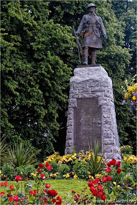
Paul. A lovely colourful image in nice surroundings. My eye is just drawn slightly to the flowers on the right edge of the image. However, yet again a good subject, well exposed and clear against what could have been a busy background. Nicely balanced over to the right of the picture rather than being centrally placed. The red flowers giving good foreground interest and the curve of the flowers draws you to the base of the statue and then up to the main subject. A very nice shot.
Fancy having to choose from these!! All wonderful subjects and great images and all winners for me! However it has to be done:-
3rd Gordon
2nd Paul
1st Tracy
Over to Tracy for the next Competition subject.


![Smile :-]](./images/smilies/icon_e_smile.gif)
