Thank you all for a cracking set of images. Flowers is a broad title and you haven't made my life easy. I have picked a winner and I will pass comment on them all but this is only my opinion.
We have three straight specimen photos from Mel, Janice and Terry.
Mel's amyryllis is a beautiful image of a strong and dominant flower. The colour is rich and saturated and the texture on the petals is well documented. There is a suggestion of depth of field into the centre of the flower.
Janice's margeritte is well positioned and exposed but the centre of the flower is a little soft and there is a dark delineation around the petals (sharpening?).
Terry's wild flower is delicate and well taken. The centre of the flower is sharp and the texture in the petals is lovely. I like the background blur but I wonder whether a tighter crop would improve it.
There are three photos of flower groups.
John has given a group of Michaelmas daisies with an interesting lens effect. The colour is great and the centre is sharp. Camera manufacturers create dense sensors, take out the low pass filter and tweak the image processing to create sharp images and photographers buy a lens that doesn't focus properly

I am joking but the effect doesn't quite do it for me.
Alistair shows the scene at Bents. The flowers are lovely ( who doesn't like pansies??) but the background is a bit fussy and the bowl a little too dark.
Alan has gone for a wild flower in context. The flower is spot on but the exposure has struggled to balance the dark blackberries and the bottom right corner is a bit too dark for me. The big bright leaf on the left takes my eye from the flower.
I am going to group the three close up/ art images.
Sue's image is a great macro image and may have won if the subject was fly but the flower is not the main part of the image
![Wink ;-]](./images/smilies/icon_e_wink.gif)
Tracey has given us a stunning high key sunflower. The background is white and the centre is crisp and precise. The petals in the bottom right are a little soft and there is a distinct yellow line around one or two.
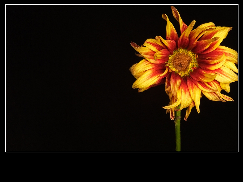
Philip has gone down a lower key line with a dense black background. The flower is spot on with great colours and I love the fact that the bloom is slightly past it's best with subtle decay. For me there is a bit too much black and I think the left side can be brought in a little. (perhaps you could have seen the flower to centre it in the frame if you hadn't taken it in the dark!!!

)
Finally there are three meadows.
Mike's image is quite simple with a very effective blur. I like the single red poppy and the framing which gives me a sense of a spiral drawing my eye deep into the image. My wife says it is like an optimistic look into the future.
Mikalosh's image is similar. The dominant poppies are central but unfortunately are slightly obscured by adjacent stems. The blur is good and I like the yellow blurring into the back of the image but I find the two blurred flowers at the top a bit distracting and the person at the top is eye catching.
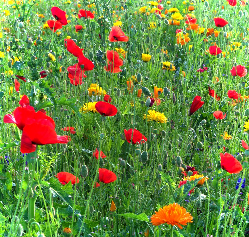
Johnjm has produced a fabulous rural meadow image from a roundabout at the top of the Leigh bypass!! Wigan and Bolton have done great things with the roundabouts in the last couple of years. This image is very crowded but it is wonderfuly sharp and the scattered red poppies hold it together. I like the back lighting on the hairs on the poppy stems and seed heads.
I could pick a winner from each of the groups but my final result is heavily biased by my personal preferences.
Third place - Johnjm
second place - Mike Aspinall
Winner - Philip Howe
Over to you.

