Page 1 of 1
Competition #20 THE KITCHEN
Posted: Tue Aug 05, 2008 4:31 pm
by Tom Gerrard
My selected theme for competition #20 :-
‘ THE KITCHEN ‘
Food, cutlery, crockery, pots and pans, utensils and appliances and people etc, etc, I feel, gives plenty of scope for your imagination.
The rising price of fuel should present no problem as you have the opportunity to reach your shoot location free of charge.
Closing time, midnight, Tuesday 19th August.
Thanks, in anticipation, Tom.
Re: Competition #20 THE KITCHEN
Posted: Sat Aug 09, 2008 3:59 pm
by bert haddock
THE DISHWASHER (NO ESCAPE)

Re: Competition #20 THE KITCHEN
Posted: Sat Aug 09, 2008 9:46 pm
by John
Kitchenware:

Re: Competition #20 THE KITCHEN
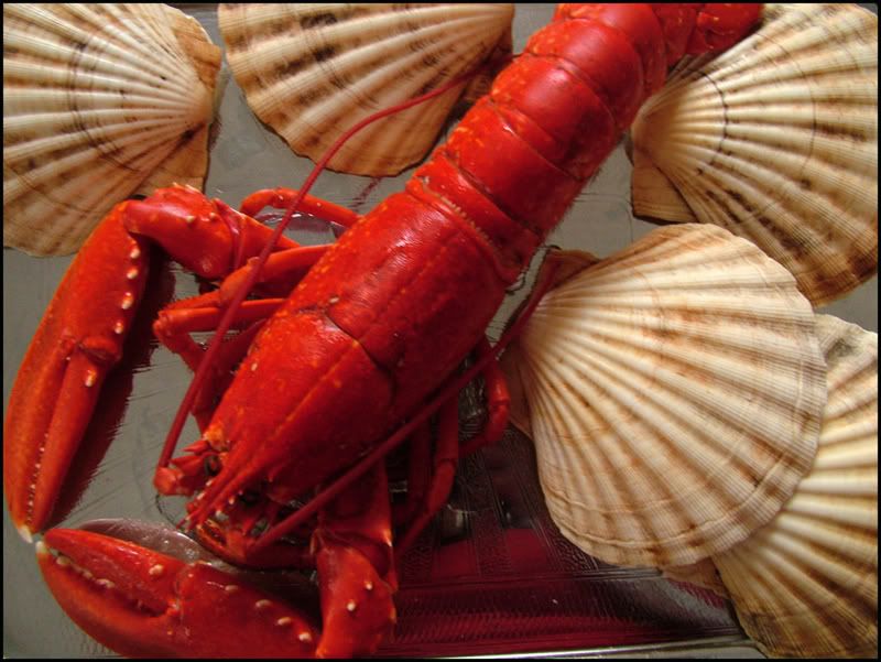
Posted: Sun Aug 10, 2008 8:56 pm
by Myra
A Lobster fit to eat.
Myra
Re: Competition #20 THE KITCHEN
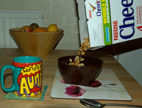
Posted: Wed Aug 13, 2008 7:17 pm
by Ruth McNally
here is my kitchen photo.
My Breakfast
Ruth McNally
Re: Competition #20 THE KITCHEN
Posted: Wed Aug 13, 2008 9:23 pm
by keith richardson
Just had a new kitchen window installed and it hasn't half improved the view.

(It will look even better when I get round to replacing the tiles).
Still no avoiding the washing up though, there always seems to be something else that needs to be washed.

PS, no trophies were harmed during the shooting of this picture..
Keith.
Re: Competition #20 THE KITCHEN
Posted: Wed Aug 13, 2008 10:19 pm
by bazzasmeg
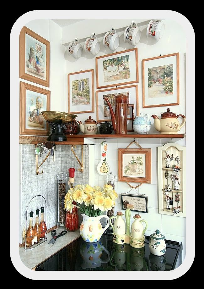
My Cosy Kitchen
Re: Competition #20 THE KITCHEN
Posted: Tue Aug 19, 2008 10:21 pm
by Walter Brooks

Bon appetit!
Re: Competition #20 THE KITCHEN
Posted: Wed Aug 20, 2008 9:58 am
by Tom Gerrard
Well that’s the end of the competition and a very difficult one to judge. So here we go.
Bert. A humorous shot by Bert trying to convince us he‘s chained to the kitchen sink, when in fact he goes on safari twenty times a year. At least we know what keeps his hands so soft! What is the matter with that poor duck on the left? A good shot.
John. This bears an uncanny resemblance to my kitchen. A good still life pic. Perhaps taken under difficult lighting conditions, judging by the numerous shadows. After the first glance, the different texture makes me look at it more and more. Well executed.
Myra. So this the kind of food you eat at Lambton Mansions is it? Fancy plonking this poor creature, whilst still alive, into boiling water, pulling it out and then asking it to pose for a photo. A good image, the kind we have come to expect off Myra, great colour, simple but effective arrangement of the components. Well done.
Len. Another good idea using everyday objects. I think more could have been done with a slightly different positioning of the subjects and I particularly like the reflection in the foreground spoon.
Ruth. Again something completely different. I know it shows various components of a kitchen ie. Fruit, coffee mug, etc. but I would have like to have seen the idea of the cereal falling into the bowl, exploited more. A greater distance between the box and the bowl would have been good. But, never having tried this kind of shot, I don’t know the problems involved. However, it as inspired me and I’m off to buy a box of Coco Pops or whatever to have a go. Great idea.
Keith. Talking about something different, you have come up trumps here. Do you really clean your silverware like this? My butler uses lemon juice and salt rubbed in with his thumb which is then buffed furiously etc.
Your kitchen has one hell of a view considering your location is Leigh or do you have telephoto windows? Technically adept, as ever, but leaves me in a state of discombobulation. Very imaginative, excellent.
Bazzasmeg. Is this really your kitchen or a record of your recent trip to ‘Kitchens ‘Я’ Us’? A really good competent shot, perhaps you could have cranked the saturation up a wee bit, because you have some lovely colours available to you (the daffodils, pottery and the pictures) that would have given your image a lot more ‘umph’
Walter. A superb close up shot. An uncomplicated subject on an effective background, good colour, nice and sharp. The carrot, green and browns complement each other so well. Not much more to say because the picture speaks for itself. An excellent example of ‘less is more’.
3rd Myra
2nd Ruth
1st Walter
Thanks once again to everyone that entered and now I’ll hand you over to Walter for the next subject.
Regards, Tom.
Re: Competition #20 THE KITCHEN
Posted: Wed Aug 20, 2008 9:37 pm
by John
Thanks for the excellent judging. An interesting challenge.
Over to Walter to start the next thread with a new subject!