Ok, following discussions at this weeks meeting, I'm going to start posting images here for constructive criticism. I'm feeling thick skinned so go ahead, I'm looking to improve, I'll let you all know when the pips start to squeak
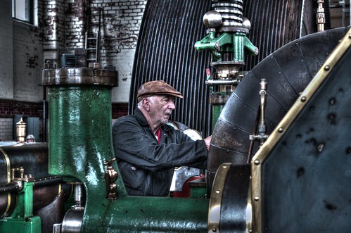
Ellenroad Engineer by john merritt, on Flickr
forge by john merritt, on Flickr
grease monkey by john merritt, on Flickr
for critique !
for critique !
Last edited by johnjm on Fri May 06, 2016 11:45 pm, edited 1 time in total.
- Paul Jones
- Iconic Photographer
- Posts: 2378
- Joined: Sun Sep 02, 2007 5:35 pm
- Spam Protection: No
- Contact:
Re: for critique !
Engineer
This is the best of the three for me in terms of impact.
Thoughts:
Great colours and exposure.
Good focus on the face.
I like that he's looking intent at what he's doing.
I would have liked to see what he's doing with his hands.
I would have personally backed off a little with the Clarity / HDR treatment.
Forge
This one doesn't work as well for me, largely due to the angle at which you've taken it. The roof of the forge is blocking all the 'action'.
Thoughts:
Why the black and white treatment? I would have liked to see the glow of the colours from the forge.
It's more 'grey' than black and white. The mono conversion could have been more punchy / contrasty for me.
It doesn't seem sharp, I'm assuming due to the shutter speed.
Grease monkey
Being totally honest I'm not thrilled with the lady's expression on this. She looks bored, so after a quick glance around the machinery there's not much more to take in. It would have been a completely different shot if she had looked like she was enjoying her work. The fact that her glasses frame is blocking her eyes doesn't help. Sorry!
Thanks for posting. Let's see more.
Paul
================
http://www.PaulJones.org
"As usual Paul is absolutely correct."
"In short, Paul is an absolutely brilliant mentor."
================
http://www.PaulJones.org
"As usual Paul is absolutely correct."
"In short, Paul is an absolutely brilliant mentor."
Re: for critique !
Paul's summed it up well. I'd add a thought about the window top left in No 1 - why not crop at the green upright cowling, then we get to really concentrate on the engineer. All the window does is to add a bright area away from the main subject and that can distract.
Best regards
John
John
-
- Chair
- Posts: 241
- Joined: Mon Oct 20, 2014 9:02 pm
- Spam Protection: No
Re: for critique !
I really like the engineer image. The colours are just right and the lighting is lovely. The expression of concentration on his face makes the image for me and I like the framing and the leading lines. I don't mind that I can't see his hands because I probably wouldn't understand what it was if I could see it!!!
The wide flat area bottom right with marks on it is a bit distracting but I don't think that you can crop it out and keep a good composition.
The forge doesn't work for me for the reasons Paul has outlined. I think colour would work better assuming that the forge bed is glowing red or orange.
Grease monkey is a bit static. The machinery is sharp and shiny but I prefer the grittier look in the first image, and there is no real sense that the machine is actually doing anything.
"People say that nothing is impossible, but some times I can do nothing all day"
Gordon
Gordon