Page 1 of 1
Beamish
Posted: Fri Mar 16, 2012 3:02 pm
by KEASLA
Re: Beamish
Posted: Sat Mar 17, 2012 11:11 am
by paulinefisher
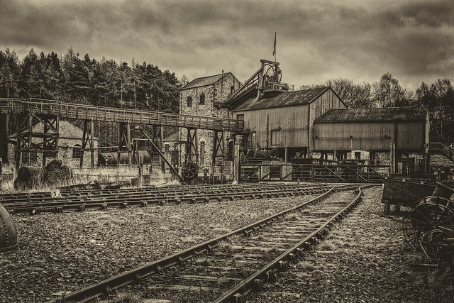
I like all three of these Jared but my favourite has to be No 2 as I prefer the tones.
Regards, Pauline
Re: Beamish
Posted: Sat Mar 17, 2012 11:19 am
by PhilipHowe
I agree with Pauline.
I'd like to see the sky a little darker in the first one as well.
Re: Beamish
Posted: Sat Mar 17, 2012 2:56 pm
by John
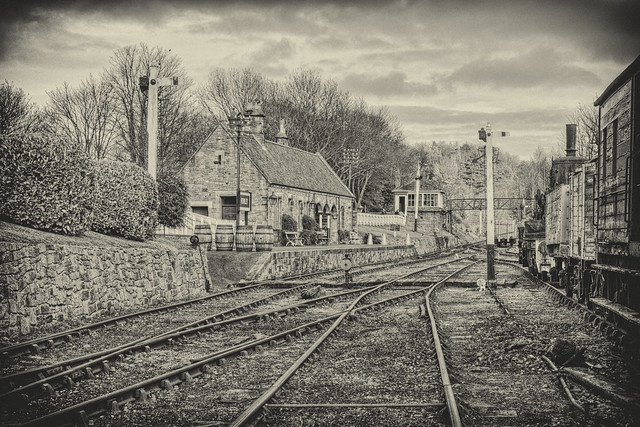
The technique in the first two is very good, it gives an etching-like appearance.
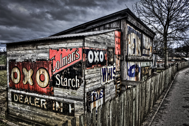
The colour treatment in the third is OK, but not as timeless as the first two.
All good photography though, and full marks for exploriung these areas of image making. You have made the subject and technique complement each other, which is excellent.
Re: Beamish
Posted: Mon Mar 19, 2012 12:43 pm
by Walter Brooks
My comments
The last one first - here and as with other images like this, the treatment does absolutely nothing for me and turns me off the image straight away.
The second image fairs better for me, although my preference is for more subtle gradation in tones in monochrome images.
The first is my favourite one of the three, with its pencil drawing quality to it.
Whilst there appears to be a lot of post capture work on the images, it would be interesting to see what they look like with a more subtle/ normal conversion to monochrome, in order to see the content of the image rather than a technique.
Regards
W