My comments
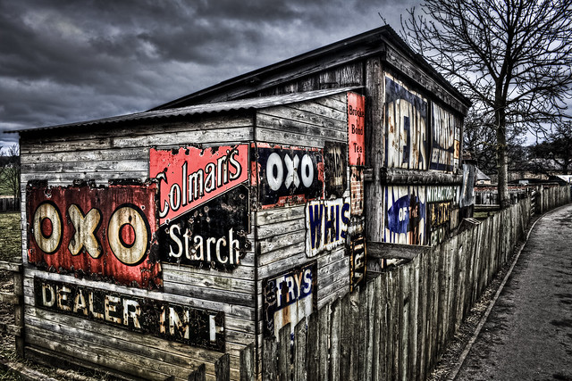
The last one first - here and as with other images like this, the treatment does absolutely nothing for me and turns me off the image straight away.
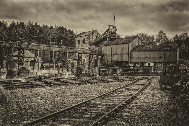
The second image fairs better for me, although my preference is for more subtle gradation in tones in monochrome images.
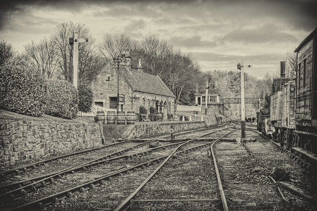
The first is my favourite one of the three, with its pencil drawing quality to it.
Whilst there appears to be a lot of post capture work on the images, it would be interesting to see what they look like with a more subtle/ normal conversion to monochrome, in order to see the content of the image rather than a technique.
Regards
W

