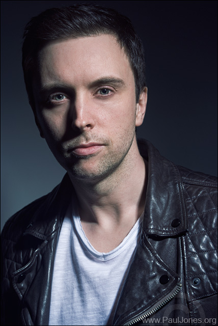
I like the pose and lighting, all perfect for the subject. The colour balance is a bit cold for my taste, and an 81 Photo Filter would add a touch of warmth. However, if a harder effect was desired then fair enough. I might be tempted to try a black and white version.
John wrote:
The colour balance is a bit cold for my taste, and an 81 Photo Filter would add a touch of warmth. However, if a harder effect was desired then fair enough.
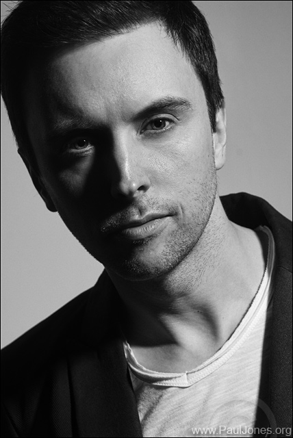
I might be tempted to try a black and white version.
Thanks for your comments John, much appreciated.
I take your point about colours and don't disagree with you. The colours were changed with a cross-processing layer in post-production as I wanted a more current, 'magazine' look.
I don't normal comment on other people work as I am still getting to grips with photography
I prefer the B&W, more dramatic with the lighting, more visual impact
stopher002 wrote:
I don't normal comment on other people work as I am still getting to grips with photography
I prefer the B&W, more dramatic with the lighting, more visual impact
Thanks Chris. You shouldn't let anything stop you from commenting.
Everyone's opinions are valid - from beginner to pro.