Beamish

A home for images for discussion and appraisal
Post Reply
User avatar
KEASLA
Photographer
Photographer
Posts: 163
Joined: Fri Aug 19, 2011 8:47 pm
Spam Protection: No
Location: Leigh

Beamish

Post by KEASLA »

Image
Beamish Iron Works by KEASLA, on Flickr

Image
Beamish Engine Works by KEASLA, on Flickr

Image
Beamish Signs by KEASLA, on Flickr
My Flickr My Twitter

As always, stern, stern but fair
User avatar
paulinefisher
Photographer
Photographer
Posts: 242
Joined: Sun Oct 18, 2009 9:17 pm
Spam Protection: Maybe
Location: Westhoughton

Re: Beamish

Post by paulinefisher »

I like all three of these Jared but my favourite has to be No 2 as I prefer the tones.

Regards, Pauline
PhilipHowe
Iconic Photographer
Iconic Photographer
Posts: 813
Joined: Thu Jun 04, 2009 11:39 pm
Spam Protection: Maybe
Location: Westhoughton (nub of the universe).
Contact:

Re: Beamish

Post by PhilipHowe »

I agree with Pauline.
I'd like to see the sky a little darker in the first one as well.
http://philiphowe.co.uk
http://facebook.com/PhilipHowe

"Twelve significant photographs in any one year is a good crop" -Ansel Adams and Philip Howe
Free Dropbox account link! http://db.tt/XvrZgQ68
User avatar
John
Iconic Photographer
Iconic Photographer
Posts: 5020
Joined: Sun Aug 19, 2007 10:34 am
Contact:

Re: Beamish

Post by John »

The technique in the first two is very good, it gives an etching-like appearance.

The colour treatment in the third is OK, but not as timeless as the first two.

All good photography though, and full marks for exploriung these areas of image making. You have made the subject and technique complement each other, which is excellent.
Best regards

John
User avatar
Walter Brooks
Master Photographer
Master Photographer
Posts: 329
Joined: Thu Sep 13, 2007 5:41 pm
Location: Bury, Lancashire

Re: Beamish

Post by Walter Brooks »

My comments

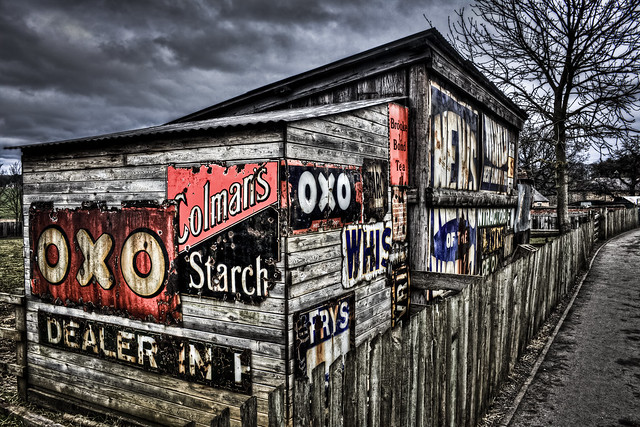
The last one first - here and as with other images like this, the treatment does absolutely nothing for me and turns me off the image straight away.

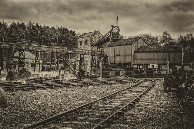
The second image fairs better for me, although my preference is for more subtle gradation in tones in monochrome images.

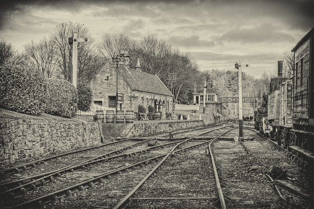
The first is my favourite one of the three, with its pencil drawing quality to it.

Whilst there appears to be a lot of post capture work on the images, it would be interesting to see what they look like with a more subtle/ normal conversion to monochrome, in order to see the content of the image rather than a technique.

Regards

W 8)
“The camera is an instrument that teaches people how to see without a camera.”
― Dorothea Lange
Post Reply